Defined a flexible content hierarchy for featured and supporting stories.
← All projects
Responsive web design · Editorial UI
Luxe Routes
A premium travel editorial experience designed to preserve hierarchy, discovery, and reading rhythm across desktop and mobile.
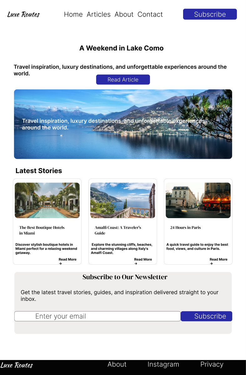
01 · Overview
Travel content depends on atmosphere and imagery, but the experience still needs to remain useful, readable, and easy to scan on every screen size.
I designed index and article views around editorial hierarchy. The goal was to balance visual impact with practical discovery rather than treating mobile as a smaller desktop layout.
DeliverablesDesktop layoutsMobile layoutsArticle templateResponsive hierarchy
02 · Process
A clear structure from question to design direction.
Explored grid, spacing, and typography at desktop and mobile breakpoints.
Refined the article layout around comfortable reading and clear navigation.
03 · Design decisions
The thinking behind the work.
Editorial rhythm
Scale and spacing distinguish the main story from secondary content without adding visual noise.
Responsive priorities
Each breakpoint protects the most important content instead of simply shrinking the desktop composition.
Focused reading
Article pages use a calmer structure so photography supports the story rather than interrupting it.
04 · Outcome + reflection
Outcome
The final direction establishes a consistent visual system for discovery and long-form reading while adapting its hierarchy to different devices.
What I learned
Responsive design became an exercise in prioritization. Every screen size required a deliberate answer to what the reader should notice first.